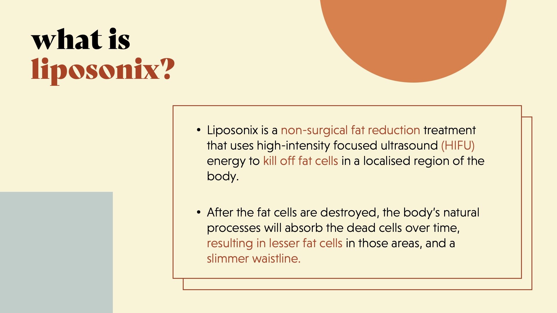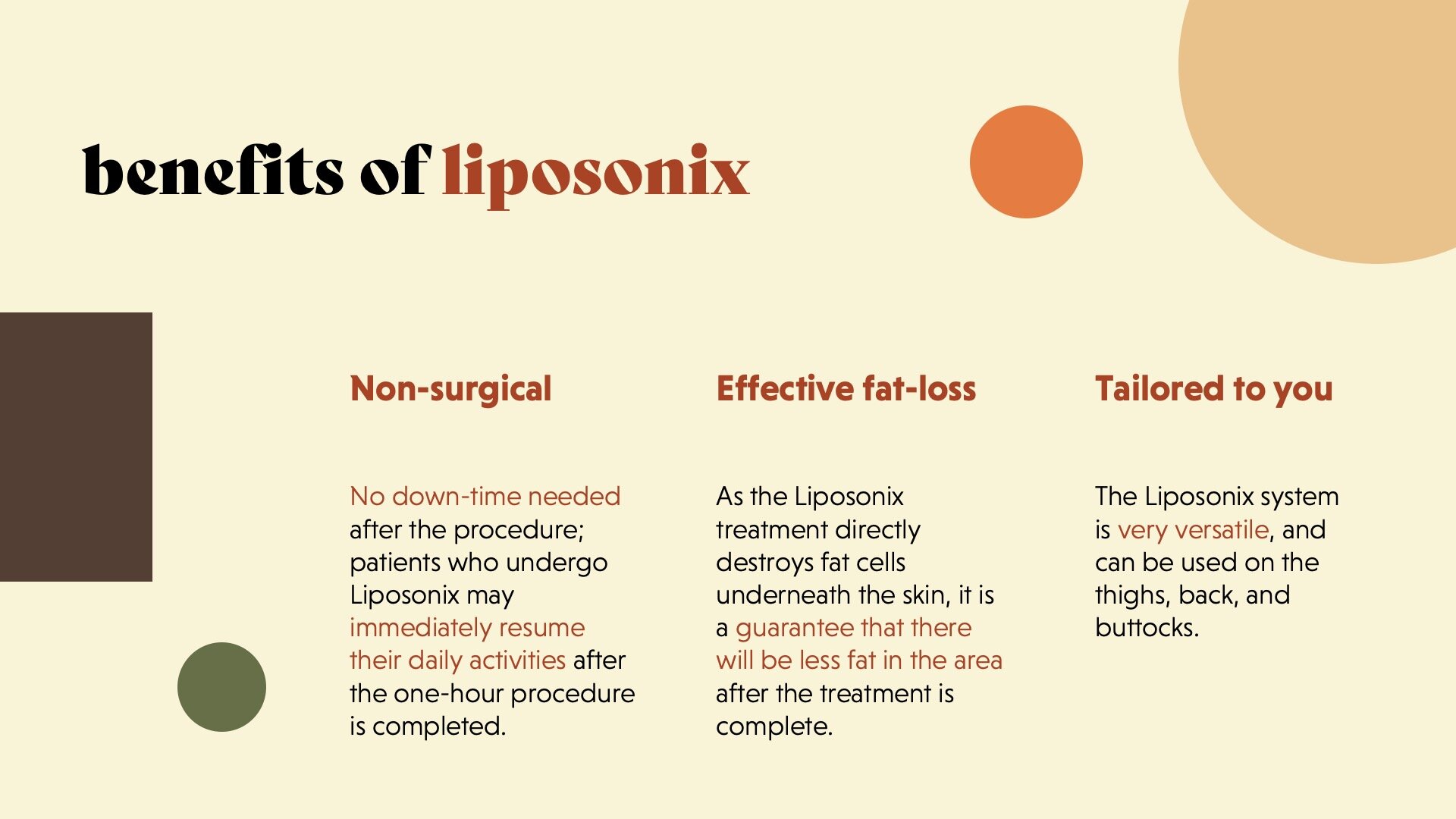
Rebrand project for a beauty salon based in London.
I designed a new visual brand identiy and leaflet to appeal to a younger modern audience and communicate the services in a more efficient and appealing way by designing a key system.
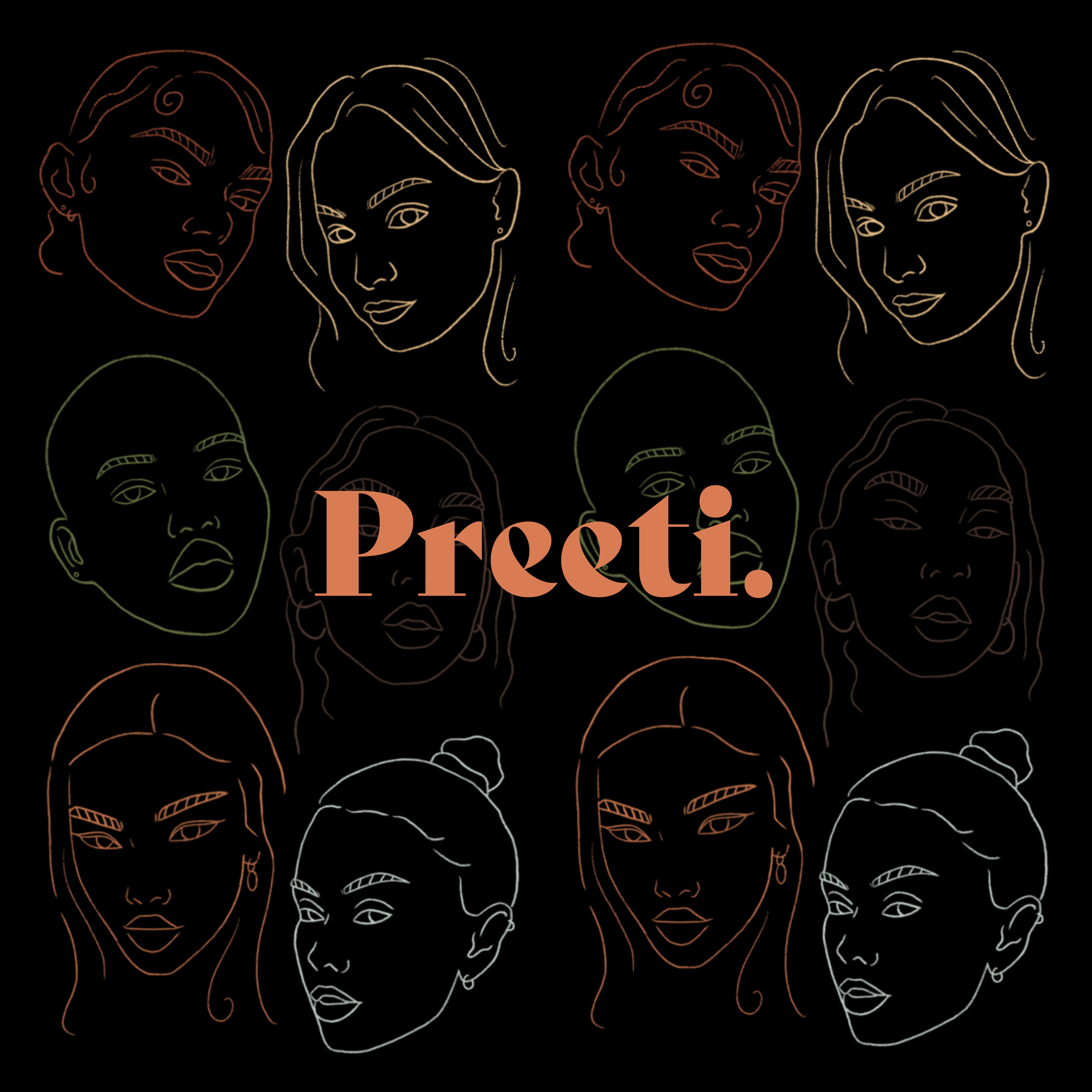


Creating the visual language.
✿ The colour palette was inspired by nature to invoke a sense of calmness and serenity associated with beauty treatments. The black and cream tones balance out the earthy natural colour scheme. Simplicity was key in this project to mimic the clean, fresh feeling the user will experience after receiving their beauty treatment.
✿ The illustration style was created using a textured brush to introduce a human element and balance out the clean sleek look with a personal touch.
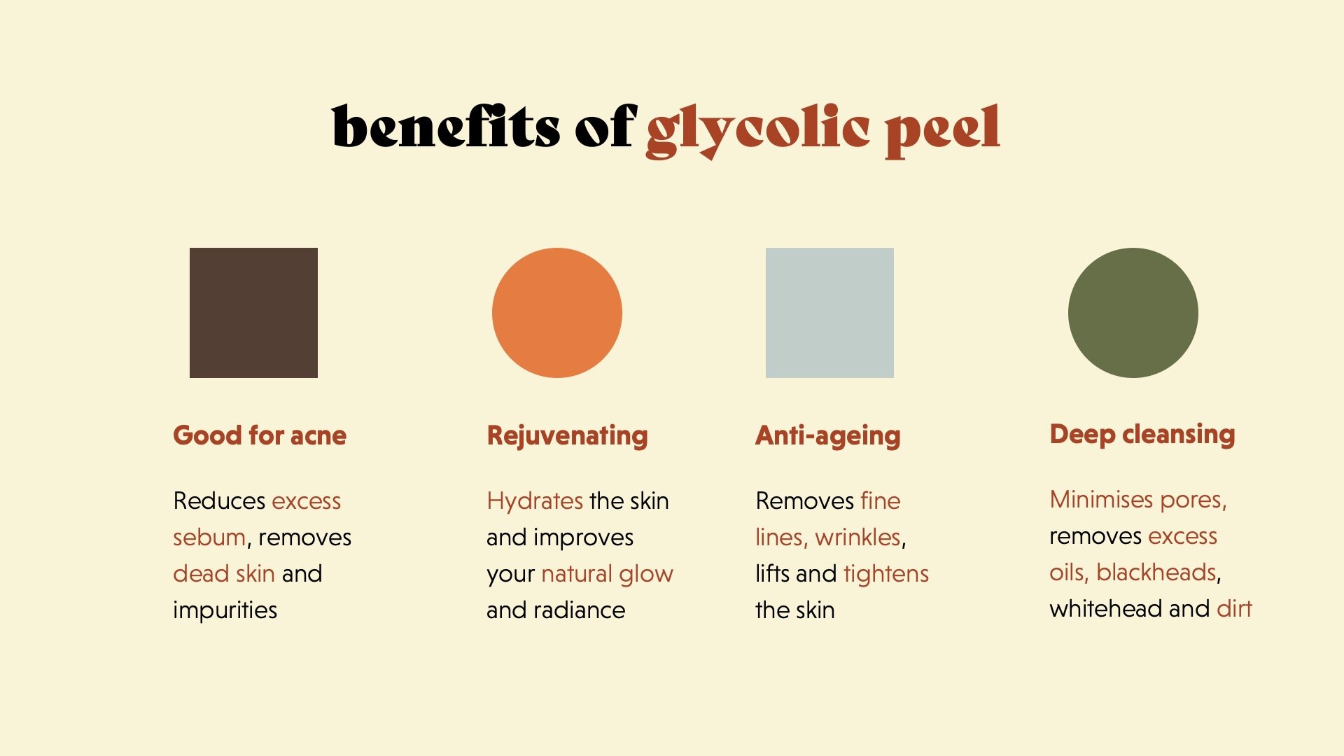
✿ I created a key for the facial treatments using simple shapes so the user can navigate through the options with ease and clarity and to avoid repetitive descriptions.
